BrandEbook.com is a Digital Museum of Brand Manual, Our collection includes: brand manual, corporate identity guidelines, graphic standards, visual identity guidelines, brand ebook, brand handbook, brand image brochure, and logo style guide.
BrandEbook.com is an open resource collection and publishing site, We collect and organize the content, but we do not own the copyright.
All files, images, audio/video files, trademarks, text translations and other materials on this site belong to their rightful authors and owners. BrandEbook.com in no case does not claim the copyright of these materials.
Welcome to join our Subscription Plan to support us, you can download the PDF brand manual.
If you would like to have a brand manual displayed on our website, or you would like to cancel your brand brochure posting, please click Contact Us to submit information.
Click here to Brand Manual Download Categories.
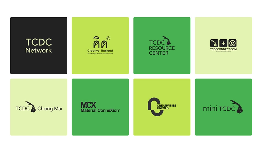
Khanom is a name given to countless sweet or savory Thai “dumplings”, imaginatively “invented” and made for generations by hand, from locally found ingredients. Khanom comes in hundreds of shapes, styles and flavors and is made from a myriad of ingredients. It is a strong and simple icon relating our Thai value creation to the natural use of raw materials.
Read more
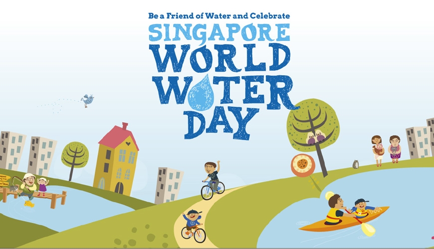
The working committee at Singapore World Water Day (SWWD) created these guidelines to assist you when using the SWWD Logo. Please review the following carefully. The logos are provided in 2 formats (eps and jpg). Any use of the Logo indicates your agreement to comply with these guidelines.
Read more
La brand identity di una destinazione turistica è l’insieme di tutte le caratteristiche, i valori e i tratti distintivi del territorio:
quegli elementi di unicità che costituiscono lo spirito del luogo, o genius loci. La marca di un territorio, a differenza di un prodotto industriale, deve necessariamente distillare un’ampia gamma di attributi tangibili ed intangibili della destinazione, tenendo conto della pluralità, ma arrivando ad una sintesi efficace.
La traduzione grafica e formale di questa sintesi è la corporate identity della destinazione, l’immagine coordinata che traduce visivamente e tangibilmente gli elementi di unicità rendendoli percepibili da ospiti e turisti.
La definizione della corporate identity territoriale è pertanto un passaggio preliminare e cruciale, che assume un’importanza centrale nell’intero processo di sviluppo del prodotto turistico e di comunicazione verso il mercato. L’immagine coordinata sarà utilizzata su ogni supporto, in ogni canale e per ogni messaggio verso l’esterno. La cabina di regia e gli stakeholder della destinazione dispongono, in questo modo, di un minimo comune denominatore grafico e tangibile per uniformare la propria comunicazione e restituire al mondo l’immagine di un territorio coeso e di un sistema che si riconosce attorno ad alcuni valori comuni.
Read more
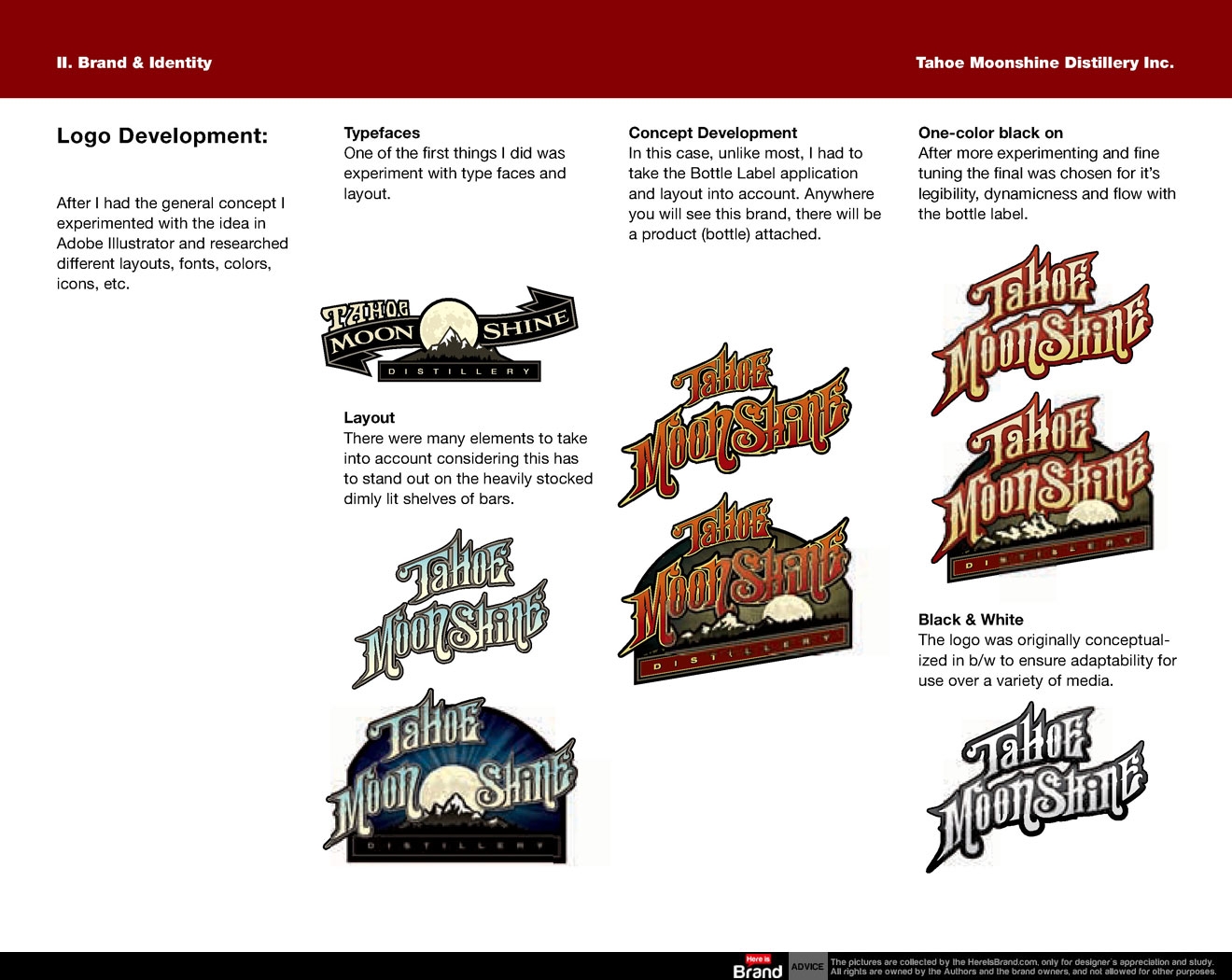
Tahoe Moonshine Distillery will strive to present itself in a very professional, authentic light. Knowing we are in a unique position in the industry in terms of bringing multiple product lines to the market we want to be perceived as innovative and unique but still adhere somewhat to the roots of the industry.
Read more
")


")


")


")


