BrandEbook.com is a Digital Museum of Brand Manual, Our collection includes: brand manual, corporate identity guidelines, graphic standards, visual identity guidelines, brand ebook, brand handbook, brand image brochure, and logo style guide.
BrandEbook.com is an open resource collection and publishing site, We collect and organize the content, but we do not own the copyright.
All files, images, audio/video files, trademarks, text translations and other materials on this site belong to their rightful authors and owners. BrandEbook.com in no case does not claim the copyright of these materials.
Welcome to join our Subscription Plan to support us, you can download the PDF brand manual.
If you would like to have a brand manual displayed on our website, or you would like to cancel your brand brochure posting, please click Contact Us to submit information.
Click here to Brand Manual Download Categories.
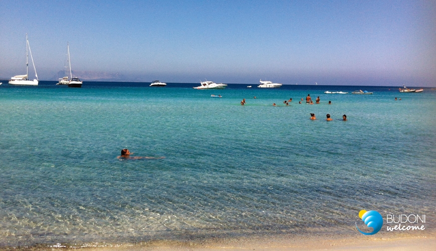
La brand identity di una destinazione turistica è l’insieme di tutte le caratteristiche, i valori e i tratti distintivi del territorio:
quegli elementi di unicità che costituiscono lo spirito del luogo, o genius loci. La marca di un territorio, a differenza di un prodotto industriale, deve necessariamente distillare un’ampia gamma di attributi tangibili ed intangibili della destinazione, tenendo conto della pluralità, ma arrivando ad una sintesi efficace.
La traduzione grafica e formale di questa sintesi è la corporate identity della destinazione, l’immagine coordinata che traduce visivamente e tangibilmente gli elementi di unicità rendendoli percepibili da ospiti e turisti.
La definizione della corporate identity territoriale è pertanto un passaggio preliminare e cruciale, che assume un’importanza centrale nell’intero processo di sviluppo del prodotto turistico e di comunicazione verso il mercato. L’immagine coordinata sarà utilizzata su ogni supporto, in ogni canale e per ogni messaggio verso l’esterno. La cabina di regia e gli stakeholder della destinazione dispongono, in questo modo, di un minimo comune denominatore grafico e tangibile per uniformare la propria comunicazione e restituire al mondo l’immagine di un territorio coeso e di un sistema che si riconosce attorno ad alcuni valori comuni.
Read more
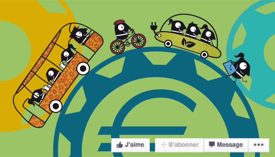
We are glad to have you on board for EUROPEANMOBILITYWEEK, the Europe-wide awareness-raising campaign on sustainable urban mobility. Together, we will be able to further the cause of sustainable urban mobility!
The objective of this campaign is to achieve a positive behavioural change towards smarter, cleaner and more intelligent urban mobility. Participation in citizen-led initiatives at the local level during the week of 16-22 September represents the highlight of the campaign. But actions are not limited to one week in the year: in addition to local authorities, other organisations that promote sustainable urban mobility at any time during the year gain valuable visibility and support thanks to the MOBILITYACTIONS feature (see last chapter).
Read more
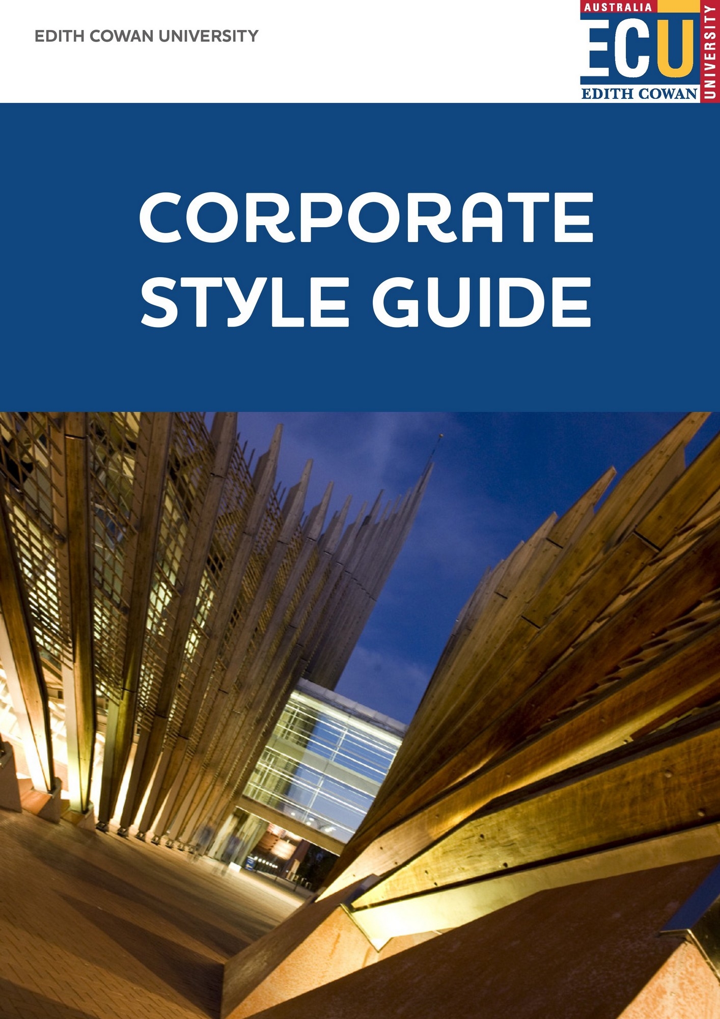
The visual identity of Edith Cowan University (ECU) is an integral part of its image. The image of the University is expressed not only in the name, logo and colours of its stationery and signage, but also in all printed material concerning each of the campuses, in the buildings - their location, furnishings and maintenance, the rites of passage within faculties and departments, and the communications between students and graduates both on and off campus.
Read more
This manual is based on the editing policy of the Visual Identity Manual published in 1996. The 1996 Visual Identity Manual is a simplified and condensed version of the original Corporate Identity Manual published in 1980 and revised in 1990. Only the rules on outward aspects were included.
Read more
")


")


")


")


