Professionals identity new look design rationale
Overall comments
The new marks and logo's makeover moves the Professionals branding to dynamic, forward-moving, exciting, positive and approachable, while retaining the clean crisp finish needed to communicate credibility and professionalism.
As part of the consideration relevant to the brand and how it relates to today’s market, with a focus on a potential large female impact in sales, OZ SOLUTIONS suggested a refinement or enhancement of the existing logo (name, underline and star inclusive) be considered.The suggestion was on the basis of reflecting the image Professionals wishes to have in the marketplace now and in the future and to reflect the elements that customers have indicated via market research that they desire (and demand) in a real estate or property company of choice.
* (approachable, credible, friendly, honest, trustworthy,caring, great communicators, energetic, dynamic, leaders in the field of property, helpful, integrity, informed, fun, knowledgeable, and outstanding service providers)
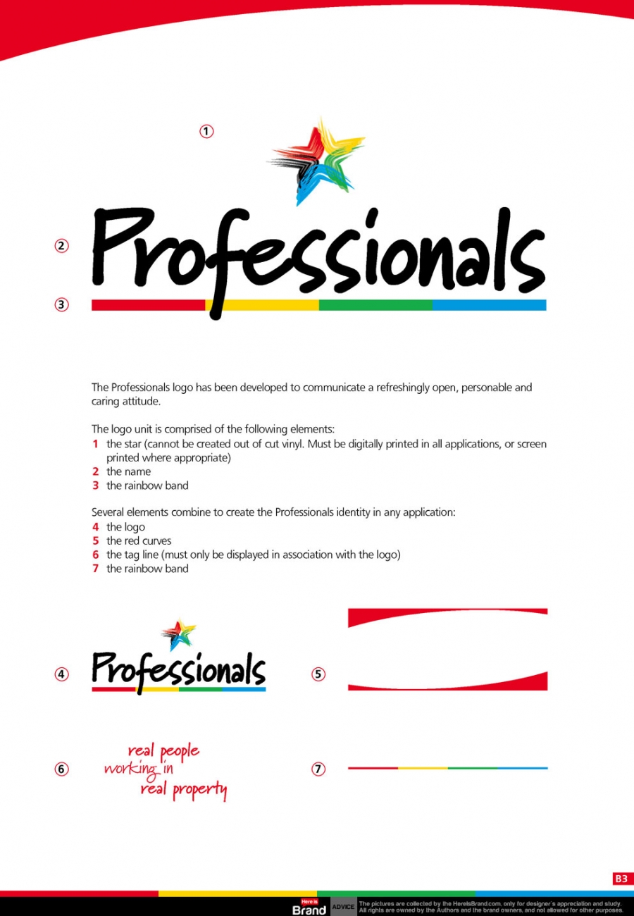
The red curve
Introduces an impressive and dynamic energy and sense of movement, indicative of a forward-moving intelligent company. Emphasising this approachable 'feminine' element enhances the overall company appeal to women, where significant buying power lies; an issue that cannot be ignored with recognised increases in the trend toward young women purchasing properties prior to relationships, not to mention the published statistic that over 90% of purchases in Australia are either made or influenced by women. Where possible, the general 'swing' of each piece ends with an upward motion; on most items this is achieved with the inverted curve, on others with the red tag line lifting the attention from the coloured line.
The coloured line
Introducing the fresh and new colours indicates variety in the company's services/fields/capabilities/locations. The colours are also used to denote specific 'profit centres': red is left as the professionals main colour, herefore encompasses everything; yellow designates general residential properties; green is a variable offer relevant to the local market focus eg could be rental, rural, commercial properties etc; while blue indicates prestige properties. This meaning is carried through window shells, building design, outdoor signage and advertising layout, with the public being educated where relevant. The coloured line is repeated at the base of each item, finishing the design off with a vivifying touch.
The logo typeface
The new font is contemporary, personal (suggesting a high quality of personal service), and full of energy. It is unique to Professionals who own this font outright.
The support typeface
Keeping the company image clean and smart, the support typeface is highly legible at all sizes, friendly, and professional. Again the font is unique to Professionals.
Downloads:
Informationen
Erstelldatum
Montag, 11. Juni 2012 06:52
Änderungsdatum
Donnerstag, 30. Dezember 1999 19:00
Version
Dateigröße
5.95 Mb
Erstellt von
BrandEBook.com
Geändert von
Downloads
8
Lizenz
Preis