BrandEbook.com est un manuel du musée numérique de la marque. Notre collection comprend : un manuel de la marque, des directives d'identité d'entreprise, des normes graphiques, des directives d'identité visuelle, un ebook de marque, un manuel de marque, une brochure d'image de marque et un guide de style de logo.
BrandEbook.com est un site de collection et de publication de ressources ouvertes. Nous collectons et organisons le contenu, mais nous ne possédons pas les droits d'auteur.
Tous les fichiers, images, fichiers audio/vidéo, marques, traductions de textes et autres éléments de ce site appartiennent à leurs auteurs et propriétaires légitimes. BrandEbook.com ne revendique en aucun cas le droit d'auteur de ces documents.
Bienvenue à rejoindre notre plan d'abonnement pour nous soutenir, vous pouvez télécharger le manuel de la marque PDF.
Si vous souhaitez afficher un manuel de marque sur notre site Web, ou si vous souhaitez annuler la publication de votre brochure de marque, veuillez cliquer sur Nous contacter pour soumettre des informations.
Marque Manuel télécharger Catégories.
Nous avons soigneusement sélectionné à partir d'un lot de manuel de la marque ( directives sur l'identité de marque de l'entreprise ), fournir une description simple et le lien de téléchargement . Cliquez ici pour accéder à la page recommander .
Evolving for the better. That is the most that nature has followed for thousands of years. In BTSA, we have also evolved to improve, and how could it be otherwise, nature has been our source of inspiration. Therefore, BTSA’s new corporate image has much to do with "what is natural”.
Our relationship with "what is natural" is not new. In fact, the key to the success of BTSA is based on natural products in both raw materials and final compounds. For that reason, we have been faithful to our principles to suit the times, with a new look much more dynamic and current, which allows a clear projection of the future.
We can define our evolution as complete, since we have preserved the best of our past to improve and adapt to this as we lay the foundations for a better future.
Lire la suite
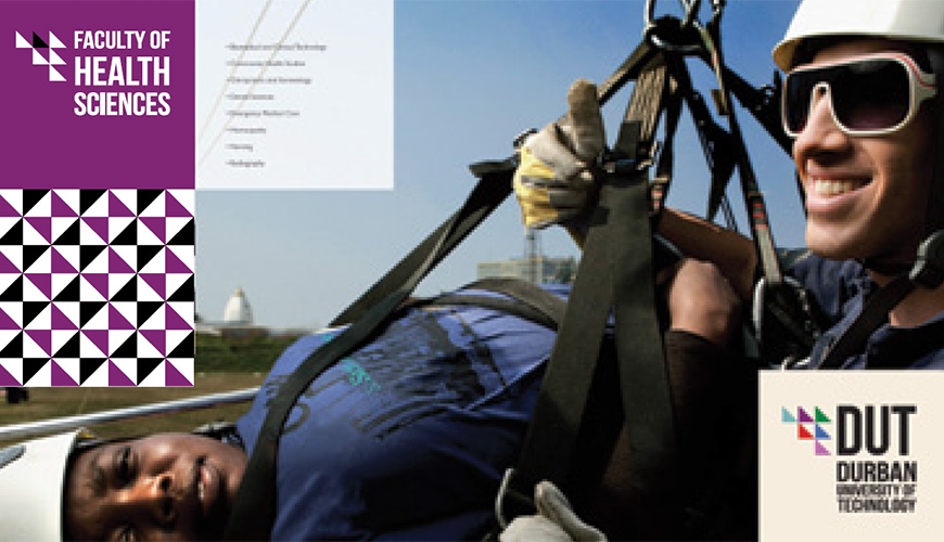
Welcome to the revised corporate identity guidelines for Durban University of Technology. This identity has been developed by staff and students of Workspace - Work Integrated Learning Design Studio in response to a strategic repositioning plan developed in 2011 and approved by Council in March 2012.
This identity is intended to provide a new platform on which we as TEAM DUT can collectively reposition how we present ourselves to our respective target markets.
This logo and visual identity has been designed to work in tandem with a modular design system, based on the square, with the idea of presenting a unified and single-minded visual voice across a wide range of uses and formats whilst retaining impact.
It is safe to add that no identity is ever complete and that we understand that brand building is an ongoing exercise, in which an identity is constantly being refined.
Lire la suite
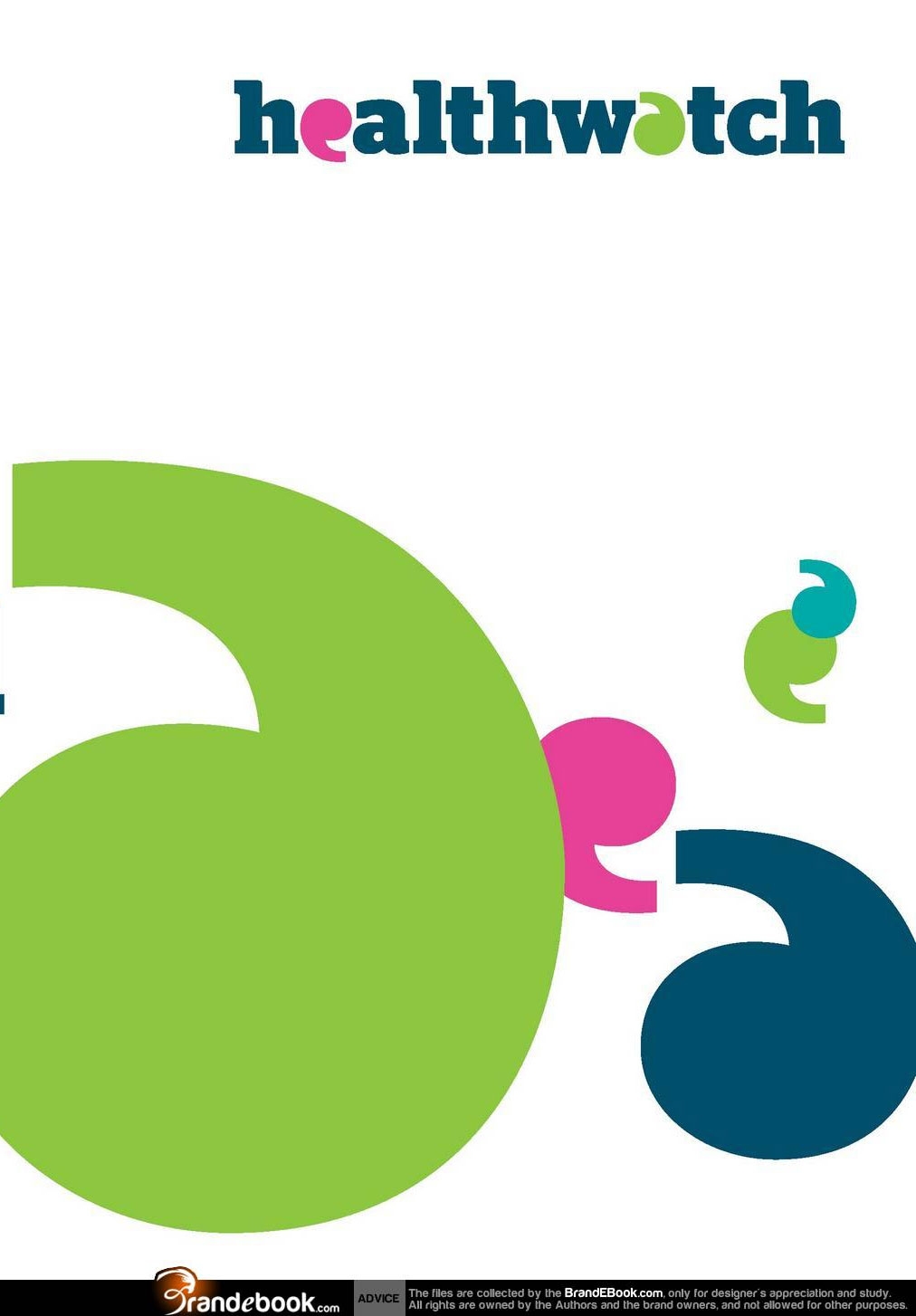
Healthwatch gives people across England a new way to engage with their local health and social care services.
Every voice counts when it comes to shaping the future of health and social care, and improving it for today. Everything that local Healthwatch does will bring the voice and influence of local people to the development and delivery of local services.
Lire la suite
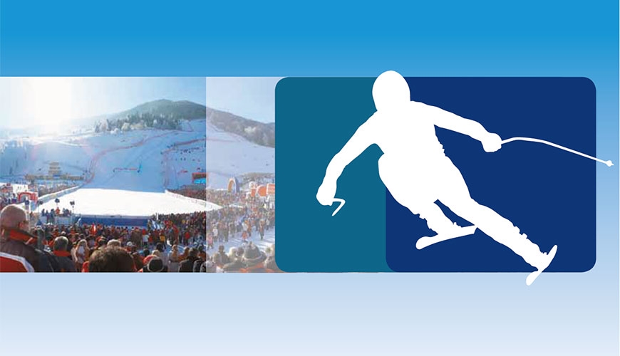
Die Leistungskraft der gesamten Region Bad Kleinkirchheim wird im gemeinsamen Auftritt gebündelt und wirkt so verstärkt nach innen und außen. Im Vordergrund steht die klare, farblich gekennzeichnete Kommunikation der Angebotsgruppen.
Im vorliegenden Manual ist die visuelle Sprache der Tourismusregion Bad Kleinkirchheim zusammengefasst. Um einheitliche Kommunikation zu gewährleisten, sind sämtliche grafische und typografische Elemente ausschließlich in dieser Form anzuwenden. Die normativen Vorgaben lassen jedoch auch Platz für individuelle Gestaltung.
Lire la suite
")


")


")


")


