")


")

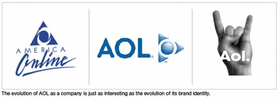
The company that used to be called AOL, and was recently spun off from Time Warner, is shrinking in size in order to survive…and now its name and logo are shrinking as well. Perhaps as a reflection of its intention to cut about 2,500 jobs, AOL has changed the UC treatment of the acronym to one that includes an upper case “A” and lower case “ol”. And, in an attempt to communicate that the company is in the internet space, it is adding a “.” after its moniker. “AOL” is now “Aol.”
AOL turns into Aol

Brand identities need to be refreshed every so often. This can be motivated by the fact that, over time, design aesthetics change and it may be necessary to refresh a design that starts to feel dated. However, changing a brand identity can also be symbolic of a change in the company’s focus or structure, or a change in the marketplace situation. In the case of AOL (oops, Aol.), the change seems to be motivated by the changes in the company’s structure and a desire to re-introduce itself to its audiences.

Is “uniquely dynamic” the same as trite and playful?
According to Tim Armstrong, the company’s CEO, “Our new identity is uniquely dynamic. Our business is focused on creating world-class experiences for consumers and AOL is centered on creative and talented people – employees, partners, and advertisers. We have a clear strategy that we are passionate about and we plan on standing behind the AOL brand as we take the company into the next decade.”
The new look was created by Wolff Olins, the same firm that also designed the much maligned 2012 London Olympics logo, and most recently the fairly unpopular NYC logo. So far, the new Aol. identity is not being embraced with much affection. Take a look at a recent article in Fast Company or read the story on CNet .
I think the new Aol. is awkward.
In my opinion, the new identity may very well be “dynamic”, but it seems to be trying too hard to look young and energetic. The playfulness seems out of line with the announcements about layoffs, and the seriousness of Aol.’s financial situation. Changing the font to lower case is a simplistic attempt to look friendlier and more accessible…while at the same time, the lower case “l” looks like an upper case “I” (which is visually confusing). In fact, I think the whole thing looks a bot awkward…and I find that the addition of the “dot” is trite – while at the same time it poses all sorts of problems when writing out the name of the company in text form – AOL simply looks and works much better than Aol. (Wait…at the end of a sentence should I add another period after the dot?). And this commentary has not even begun to take into account the backgrounds from which the letters Aol. are reversed out. What is that pink cloud? Perhaps a bit of cotton candy? And, what is the green scribble? I find that the is dot hard to read in that version. Do you? BTW: In Italy the hand image stands for “cuckold”…I think that’s pretty funny.
Авторизуйтесь, чтобы получить возможность оставлять комментарии
")


")


