")


")

In my last posting I discussed the new Pepsi brand design, and it seems appropriate to follow that dialog with some thoughts about Coca-Cola’s recent brand revamp. As it may have been apparent, I am not a big fan of Pepsi’s latest branding efforts. In my opinion, the new logo is not much of an improvement over the old one, and the packaging seems rather generic and sterile. On the other hand, I am truly impressed with what Coca-Cola just did.
Coca-Cola’s recent brand revamp
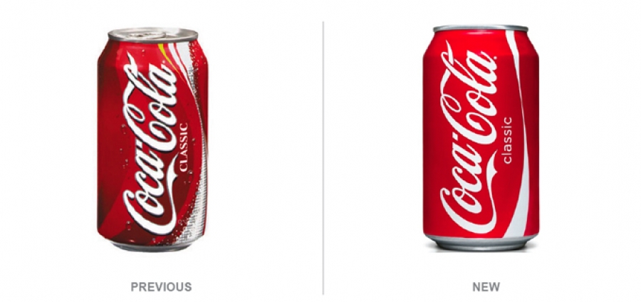

The designers have stripped away everything that was not essential and exercised a great deal of restraint in the new design. The typography that identifies the product as “CLASSIC” has been modernized and it is now all in lower case. This simple gesture seems to have an informality that is admirably on brand with the personality I expect of Coca-Cola. It is friendlier and more approachable. In my opinion, the fact that the design refresh is, at first glance, almost unnoticeable is also refreshing. I think this is a very respectful way to treat a classic icon. Yet the changes – once noticed – are definite improvements.

I’m also a fan of the Coca-Cola Zero packaging. The red Coca-Cola logo on the solid black background has an edge to it, yet it seems like a natural extension of the brand. And I love the aluminum bottles. They remind me of the way I felt when I first saw the redesign of the VW beetle by Jay Mays – a modern interpretation of a classic that re-invents the vehicle while making it feel like a natural evolution of the original.

The item that caught my eye and made me look further into the re-design was the ubiquitous white paper cup from fast food restaurants, but this time it featured the red silhouette of the Coca-Cola bottle. One of our designers walked into our office sipping from the cup, and I just loved the way that the straw looked like it was coming from the bottle. This design is fun yet really smart. The simple graphics imbue the paper cup with a sense of nostalgia and playfulness that are perfectly aligned with the brand. Also, I love the design of the delivery trucks. I have not seen these on the streets yet, and can’t wait to see the reaction that people will have when they first see them. I like the fact that the visual is an allegory to the purpose of the truck – which is to deliver Coca-Cola products…and the oversize bottle seems to say “this brand is bigger than life” – and, given that Coca-Cola is considered the most valuable brand in the world, it makes sense. Once again, the design is playful and impactful…yet it is completely appropriate.
It’s nice to see a brand like Coca-Cola exercise the design discipline it did with its latest branding efforts. This work is honest, clean, fresh – and it has lots of personality – and I hope that more brands are inspired by it.
Login to post comments
")


")


