")


")

Occasionally brands need a little refreshing. Pepsi recently announced that it is canning BBDO Worldwide, which has produced campaigns for the brand since 1960, in an effort “to refresh Pepsi’s communications,” according to Dave Burwick, the new chief marketing officer for the PepsiCo North America beverages division. PepsiCo also selected the Arnell Group as its design agency for brand identity and packaging.
To Refresh Pepsi’s Communications

Well, pardon the pun, I am not so sure there is anything “refreshing” at all about the new Pepsi identity that Arnell just designed. In fact, it seems like such a missed opportunity…and an amazing waste of money.
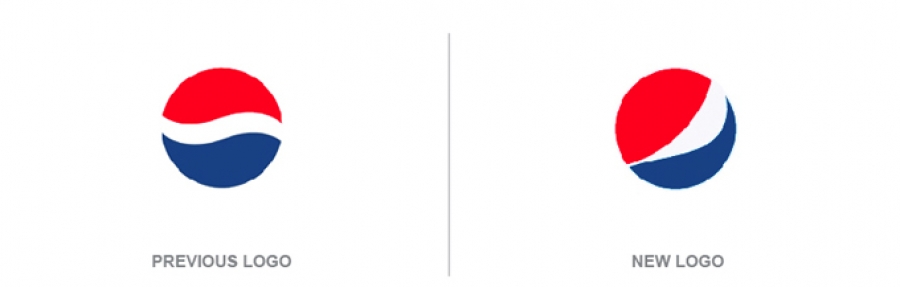
Theoretically, the new logo is much improved and much more dynamic because it flashes a smile. That may be so…but when I look at the new packaging it seems generic and impersonal….and that does not make me smile at all. Lately a few venerable brands have undergone makeovers that I think are questionable: AT&T and Xerox, for example. Pepsi is the latest one to join the group.

In the case of AT&T, in an attempt to make the unfriendly company come across as more approachable, the classic logo became dimensionalized. Surely AT&T wanted to come across as a contemporary, friendly and dynamic company. Instead, the symbol seems executed by a design student trying too hard to make something look cool

Then there is the new Xerox logo. Again, I’m sure that someone thought that the digitized X that we had come to associate with Xerox had become obsolete…and that the company’s sophisticated digital solutions were not properly represented by something that actually looked digitized. Apparently “the sphere-shaped symbol with lines that link to form an illustrative “X,” represents Xerox’s connections to its customers, partners, industry and innovation”. Personally, I think it looks like a red version of the Xbox360 logo.
Now we have the new Pepsi logo. After months of work…during which time much consideration was given to “preserving the heritage of the Pepsi brand, while creating a more vibrant and energetic logo that will help Pepsi connect with its customers”. As a result of all this effort, in my opinion, the designers came up with something just as impersonal as the old logo. According to some reports the re-brand will cost the company in the neighborhood of $1.2 billion.

However, as I am fond of saying “a logo does not a brand make”. So, let’s take a look at the packaging…which is probably the most important manifestation of this brand. When I take a look at the “before and after” images, I can’t help but feel a mix of confusion, disapproval and disappointment. Perhaps Pepsi is trying to be more minimalist…but I think it the brand just comes across as generic and cheap. Is this design better? Will it make any difference at all?

Lastly…I wonder about the strategy behind the logo modifications that are featured on the cans of Pepsi, Diet Pepsi, and Pepsi Max. I guess that Pepsi Max is supposed to make my smile bigger?
Really….what is the point? I am not smiling.
Please feel free to comment!
Login to post comments
")


")


