")


")

Liquid recently designed the brand identity for Hextec Inc., an innovative hand and power tool company with headquarters in Shanghai. The first set of products includes the Hextec Stealth screwdrivers, featuring a patented dynamic quick-release bit changing mechanism and will be available at retail in North America with The Home Depot beginning in Spring of 2012.
Brand Identity for Hextec Inc


A collaboration between Liquid and HerbstProdukt.
Hextec, a leader in the tool category is based in Shanghai, but sells its products to retailers worldwide. In its effort to continue to grow its market share, the company wanted to develop a set of products specifically designed to appeal to a younger and more design savvy consumer. Realizing that they needed to work with a design team that has a fresh approach and a global perspective, the company reached out to HerbstProdukt for the industrial design and to Liquid Agency for the brand identity component of the assignment. The two firms are both based in Silicon Valley and have collaborated on award winning products that range from consumer electronics to kitchen tools.

Hextec: A brand that is rugged and sophisticated.
HerbstProduckt took the lead on the assignment by developing an industrial design language that positions the brand as a premium alternative. According to Scot Herbst, principal of HerbstProdukt, “I felt that the brand should be perceived as being about hard working tools that just happen to be beautifully designed. They are sophisticated, but in a very industrial, very rugged kind of way. ” The brand language leverages “hexagonal” geometric details inspired by the brand name, and suggests concepts of engineering, precision and quality. Scot discussed these ideas with Alfredo Muccino, the founder and Chief Creative Officer at Liquid Agency, and they agreed that the logo should embody these same qualities.

Engineered to stand out for all the right reasons.
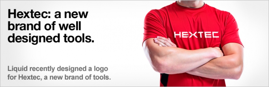
The brand identity steers away from a decorative approach, instead it is a very simple and bold typographical solution in which the the “X” in Hextec becomes the most iconic component. The design of the Hextec identity takes into consideration the fact that it needs to be showcased prominently on the products becoming an easily recognizable signature element. The color red implies strength and power, while the grey alludes to the industrial nature of the products. The combination is not new, but the way in which the industrial design and the identity design are combined offers an alternative to traditional tools that is definitely contemporary and modern. According to Alfredo, “We’re very happy about the balance that we have been able to achieve between elegance and functionality. The brand stands out from the alternatives, but it does so in a way that it will be considered a serious tool. The brand’s elegance is born out of its purposeful engineering, we steered away from any type of decorative aesthetic”

Elegant packaging is focused on less, not more.
According to Alfredo, “We are using the Hextec Screwdrivers as the starting point, but in reality Liquid is working on a packaging system that can be applied to a full range of products”. The packaging will be designed to convey the premium level of the brand – and will need to accommodate products that hang on pegs and products that sit on shelves. “We are still at the very early conceptual stages. But we hope that the packaging will be as smart as the products – which in our opinion means less packaging. I am challenging our designers to “engineer” the packaging design solution to use the least amount of materials and minimize the impact on our environment while lowering the manufacturing costs. That’s what we consider to be smart design.”
Login to post comments
")


")


