")


")

Austrian Airlines Group is made up of three carriers, Austrian Airlines, Tyrolean Airways, and Lauda Air, serving 123 destinations in 64 countries on five continents. For over 40 years, national leader Austrian Airlines has presented itself as a progressive, future-oriented airline whose major aim was to deliver its clients best quality, security, and service.
Austrian Airlines: An airline brand springs to life
Challenge
Following a detailed appraisal of the company's position within the marketplace, and based on economic and commercial factors, Austrian Airlines decided to reposition its brands to make them as relevant to customers and differentiated from the competition as possible. Landor was asked to develop a brand strategy and positioning, and a brand architecture, which would then be translated into a visual identity.
Solution
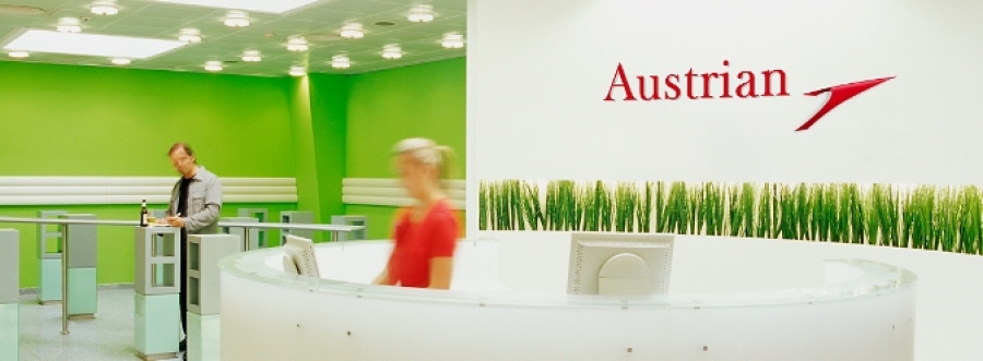
Based on the company's qualities, brand strategy, and architecture, Landor developed a logo and brand platform expressed by the Brand Driver(TM) Spirit of Spring – a determination to put color, freshness, and liveliness back into the customer experience. The revitalised logo, an evolutionary, dynamic development of the existing arrow, is a red chevron, stylizing a plane taking off. The identity was implemented across the entire passenger experience, including lounges, concourse check-ins, website, and cabins. Austrian Airlines reported a 37 percent jump in passenger traffic following the relaunch.

Johannes Davoras, VP Corporate Market Communications, Austrian Airlines Group

The revitalized identity as it appears on an Airbus A330.
Авторизуйтесь, чтобы получить возможность оставлять комментарии
")


")


