The origins of the Gisborne District Council brand are self evident. Nevertheless there is a story that it tells and a story to be told about it, especially concerning its form and colour.
The brand has an intimate connection to Te TairÄwhiti as a region and community. It is steeped in cultural heritage, a relevance that touches all corners of the cultural diversity, giving our place to live, work and play its very own unique character. TairÄwhiti – meaning – The coast (Tai) where the sun (rÄ) shines (whiti).
Gisborne District Council Branding and Style Guide
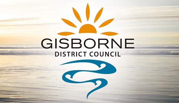
THE SUN: The sun is the primary icon of the region.
TairÄwhiti – in this case rÄ is a shortened version of the word rangi, which can mean day, sky, heavens, heavenly realm, weather, air, or melody. Rangi is a shortened version of the word Ranginui and Ranginui is the traditional mÄori creation god the Sky father.
The sun has always made an easy worldwide and cross-cultural connection. It is new each day and as such is always fresh; reborn; it denotes a new start; a new beginning; and Te TairÄwhiti is the “fi rst to see the sun”.
The sun also stands for longevity and is forever constant. It is dependable, energising, life-giving, healthy and clean.
The burnt orange colour is a sunrise colour and makes reference to ata hÄpara or the dawn when the sun fi rst peeps over the horizon. It is the colour of the new day.
The seven rays of the sun in this logo parallel each of the district’s seven electoral wards and the semi-circle of the sun is Council itself. The shape of the rays recognises the region’s strong ocean-going navigation heritage as boat and waka silhouettes.
THE wATER: water, in all its forms, is vital to life and another primary icon of the region. The water in this logo is active, rolling like a set of waves on the shore or fl owing like a river across the landscape. It has direction and purpose about it and touches on the themes inherent in the strategic visioning of Council.
As waves, this icon highlights the district’s geographical fame and lifestyle. As a river it talks of our hinterland bringing its bounty to the port and the sea, and to the rest of the world. As a river it also gives recognition to the communities that form around each of our district’s great river systems and unites each of them atour shared shore line.
This form also represents land. The top part is an horizon line that curves around to form East Cape and winds down our coast line forming headlands and bays as it goes. The stylised koru shapes within these headlands and bays are our communities that have based themselves between the hill country and the sea.
The blue colour used here is a green blue based on the ocean colours found on our coast and at the Gisborne Port.
Downloads:
Only registered and logged in users can download this file.

Information
Created
Thursday, 01 August 2013 22:09
Changed
Thursday, 30 December 1999 19:00
Version
Size
4.29 Mb
Rating
Created by
BrandEBook.com
Changed by
Downloads
0
License
Price