")


")

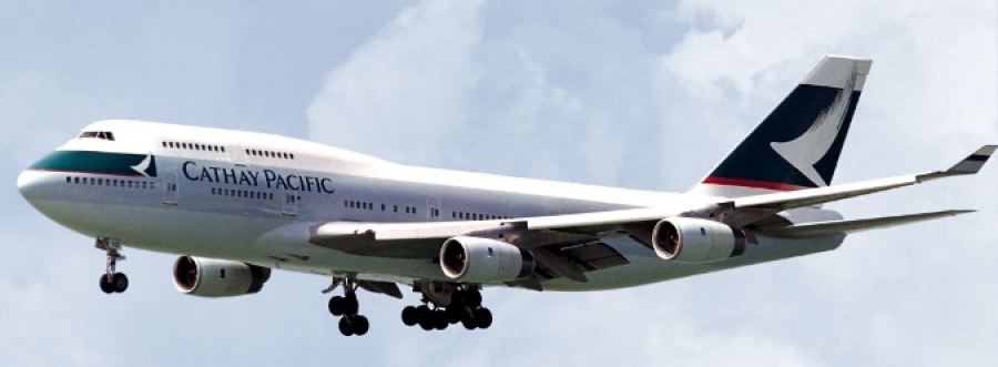
Cathay Pacific began as a British airline based in Hong Kong. It had enjoyed an excellent reputation for quality of service but had become somewhat tired looking as its identity had not been updated since 1970. With the Asian air transport market growing fast, Cathay was evolving to meet the burgeoning travel demands. Cathay management determined that a corporate identity renewal was necessary to signal the changes within the company and preemptively respond to growing competition in the region. In view of the forthcoming handover of Hong Kong to the Chinese government, and in recognition of Cathay’s Asian heritage, marketplace, and employee base, the old expatriate image needed to change.
Cathay Pacific Airways: Crafting an enduring brand
Challenge
Cathay asked Landor to create a comprehensive identity program that would convey attributes of service, professionalism, technological developments and, importantly, the airline’s Asian roots. The company also wanted to retain its equities in the Cathay name, the color green, and the Swire Group endorsement. We conducted extensive consumer research in Cathay’s six key markets. Our results indicated that although Cathay did have equity in its green and white colors, the striped identity itself was outdated, inconsistent, and carried no Asian meaning or style.
Solution
Landor developed the
Авторизуйтесь, чтобы получить возможность оставлять комментарии
")


")


