BrandEbook.com is a Digital Museum of Brand Manual, Our collection includes: brand manual, corporate identity guidelines, graphic standards, visual identity guidelines, brand ebook, brand handbook, brand image brochure, and logo style guide.
BrandEbook.com is an open resource collection and publishing site, We collect and organize the content, but we do not own the copyright.
All files, images, audio/video files, trademarks, text translations and other materials on this site belong to their rightful authors and owners. BrandEbook.com in no case does not claim the copyright of these materials.
Welcome to join our Subscription Plan to support us, you can download the PDF brand manual.
If you would like to have a brand manual displayed on our website, or you would like to cancel your brand brochure posting, please click Contact Us to submit information.
Click here to Brand Manual Download Categories.
Whether we like it or not, first impressions count.
To help control that impression among external audiences, brands are created to embody the positive spirit of a company and the nature of its business. Once that brand has been created, it needs to be carefully monitored and adhered to by all stakeholders within the company. Whatever the members of the company do - be it sending a letter, placing an advertisement, attending a meeting or telling a friend about what they do at work - a consistent message should be communicated and the same positive impression should be created.
Read more
Welcome to the revised corporate identity guidelines for Durban University of Technology. This identity has been developed by staff and students of Workspace - Work Integrated Learning Design Studio in response to a strategic repositioning plan developed in 2011 and approved by Council in March 2012.
This identity is intended to provide a new platform on which we as TEAM DUT can collectively reposition how we present ourselves to our respective target markets.
This logo and visual identity has been designed to work in tandem with a modular design system, based on the square, with the idea of presenting a unified and single-minded visual voice across a wide range of uses and formats whilst retaining impact.
It is safe to add that no identity is ever complete and that we understand that brand building is an ongoing exercise, in which an identity is constantly being refined.
Read more
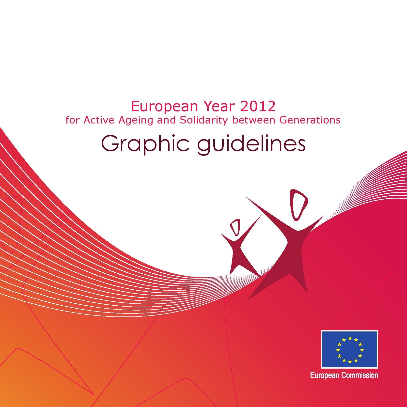
This manual presents the basic elements in the European Year for Active Ageing and Solidarity between Generations 2012 logo to all those who will use it.
The logo must always be reproduced from the master artwork. It must never be altered in any way.
Symbol
Two persons, where one is smaller (younger) than the other, connected to each other stands for Solidarity between generations.
The arrow represents a future looking outlook for Active Ageing.
The choosen colours raspberry and plum are choosen to convey warmth and energy.
Read more
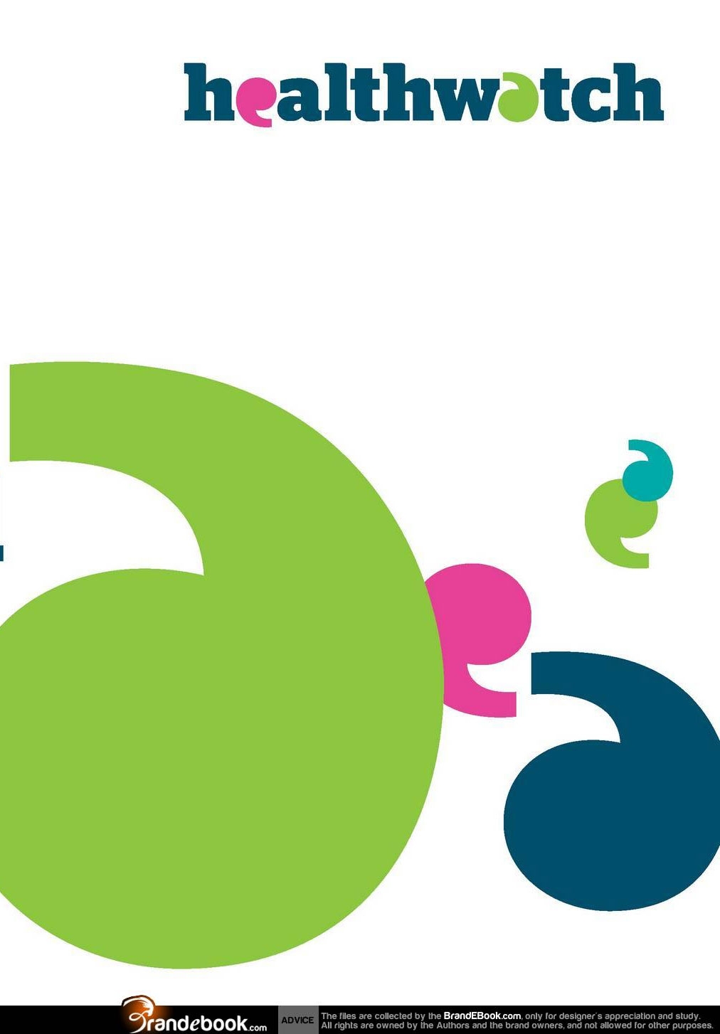
Healthwatch gives people across England a new way to engage with their local health and social care services.
Every voice counts when it comes to shaping the future of health and social care, and improving it for today. Everything that local Healthwatch does will bring the voice and influence of local people to the development and delivery of local services.
Read more
")


")


")


")


