BrandEbook.com - это Цифровой музей руководства по бренду. В нашу коллекцию входят: руководство по бренду, руководство по фирменному стилю, графические стандарты, руководство по визуальному оформлению, электронная книга по бренду, справочник по бренду, брошюра с изображением бренда и руководство по стилю логотипа.
BrandEbook.com - это открытый сайт сбора и публикации ресурсов. Мы собираем и систематизируем контент, но нам не принадлежат авторские права.
Все файлы, изображения, аудио / видео файлы, товарные знаки, переводы текста и другие материалы на этом сайте принадлежат их законным авторам и владельцам. BrandEbook.com ни в коем случае не претендует на авторские права на эти материалы.
Добро пожаловать, чтобы присоединиться к нашему плану подписки, чтобы поддержать нас, вы можете скачать руководство по бренду в формате PDF.
Если вы хотите, чтобы руководство по бренду отображалось на нашем веб-сайте, или вы хотите отменить размещение брошюры о бренде, нажмите «Связаться с нами», чтобы отправить информацию.
Нажмите кнопку просмотра всех бренд справочник каталог.
Purpose of This Document
The Real brand consists not only of brand marks or logos but also the basic architecture of product and services names applied to various assets we own as a company. The purpose of this document is to provide a set of guidelines to help facilitate and inspire communications that build and maintain the Real brand we are striving to embrace.
A brand is only as strong as the consistency of the communication materials used to express it. Messages that deviate from the brand will be confusing to the audience and weaken the equity of the brand.
All design elements, including our marks, color, typography and messaging play an important role in supporting and reinforcing a consistent identity and visual style for Real. These brand standards have been developed to explain elements of Real's identity and provide guidelines for implementation and management. They help us:
Read more
Graphic standards reinforce the visual identity of a company or corporation. Graphic identity is the cornerstone of communication efforts. Inconsistent visual and conceptual images confuse our publics and undermine messages. Consistent use of graphics, symbols, color and typography increase the University’s level of visibility and credibility, and enhances its image.
Read more
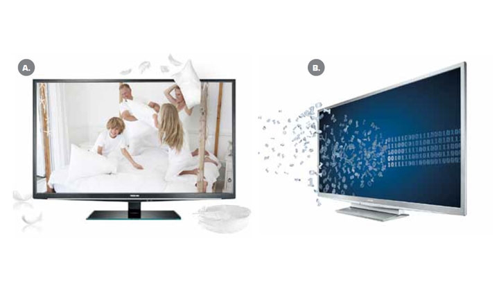
Toshiba is all about making extraordinary technology available to everyone. Our brand is brimming with the passion to help technology enrich people’s lives. Toshiba’s tone of voice comes from a fundamental point of view. We always see things from the user’s perspective. And how they want technology to better their lives.
Take for example the new tablet. Yes, it’s the world’s thinnest. But that message comes straight from our internal obsession and passion for the best technical engineering. For the user it means he or she can take their tablet easily to more places – to bed, to the garden or pack it for a holiday. It becomes the most handy way ever to access fun, do the shopping, enjoy films and more.
Read more
The following visual identity manual aims to convey the same brand identity to the stakeholders. The right application of the guidelines listed hereafter will provide brand equity protection and related value, complying with the corporate communications strategy.
Read more
")


")


")


")


