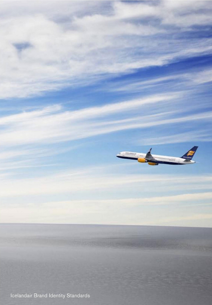
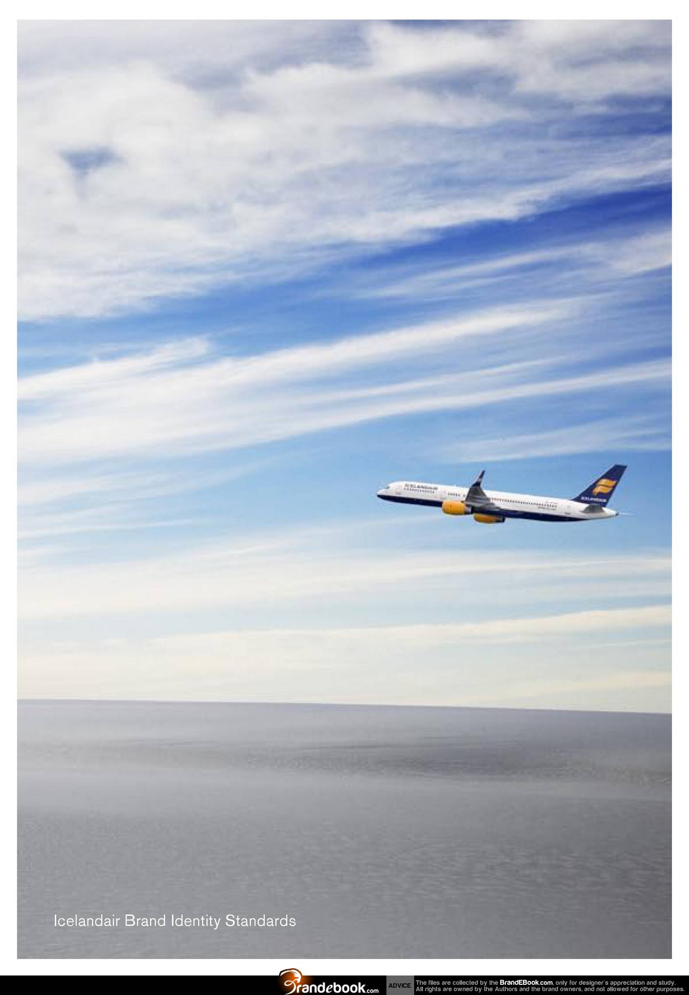
This document describes our brand identity standards.
It is about our marketing position, personality, our visual identity and our tone of voice.
It will help you understand how we want to communicate to keep our brand identity consistent.
The logo
The Icelandair logo is at the core of the company´s brand image.
It symbolises in a direct way what Icelandair stands for and should be able to stand alone and still be a reminder of our business values.
It is the most important signature of the company and, at all times, needs to be treated with care and respect.
The histor y of our logo and colors
When the current logo was developed the objective was to make the logo more contemporary and international while still maintaining a strong link to Iceland´s culture and heritage.
The logo combines strong oranges and yellows, reflecting key natural elements of Iceland - the volcanoes and the midnight sun. The colors are graduated to create a three-dimensional effect of movement and energy. The form of the symbol represents the wings of flight and is an evolution of the original Icelandair logo.
The blue of the mark is inspired by the deep dark seas that surround Iceland and are integral to Iceland´s identity and culture. This color also shows the Nordic side of Icelandair and the quaility it stands for. The blue provides a strong contrast to the orange/yellow of the logo and enhances its strength and visual impact.
Downloads:
Information
الإنشاء
السبت، 09 حزيران/يونيو 2012 23:47
Changed
الخميس، 30 كانون1/ديسمبر 1999 19:00
Version
الحجم
6.12 Mb
أنشئ بواسطة
BrandEBook.com
Changed by
الملفات
7
الترخيص
السعر
")


")

")


")


