BrandEbook.com is a Digital Museum of Brand Manual, Our collection includes: brand manual, corporate identity guidelines, graphic standards, visual identity guidelines, brand ebook, brand handbook, brand image brochure, and logo style guide.
BrandEbook.com is an open resource collection and publishing site, We collect and organize the content, but we do not own the copyright.
All files, images, audio/video files, trademarks, text translations and other materials on this site belong to their rightful authors and owners. BrandEbook.com in no case does not claim the copyright of these materials.
Welcome to join our Subscription Plan to support us, you can download the PDF brand manual.
If you would like to have a brand manual displayed on our website, or you would like to cancel your brand brochure posting, please click Contact Us to submit information.
Click here to Brand Manual Download Categories.
Fiat. A new logo for a new identity
The time has come . Fiat is reflected in the new image. A new identity . A new challenge . A new logo , but one with a past. It is a modern , contemporary reinterpretation of the famous emblem that adorned the 1931-1968 Fiat hoods .
Read more
For the first time in history, all branches of Kentucky government will speak with the same unified voice. I also encourage every local and regional governmental agency, state-supported institution and private corporation and business to join in this effort.
This is not simply state government’s brand. This is Kentucky’s brand. It was created as the result of an unprecedented research effort and was selected by Kentuckians themselves via a statewide vote.
Read more
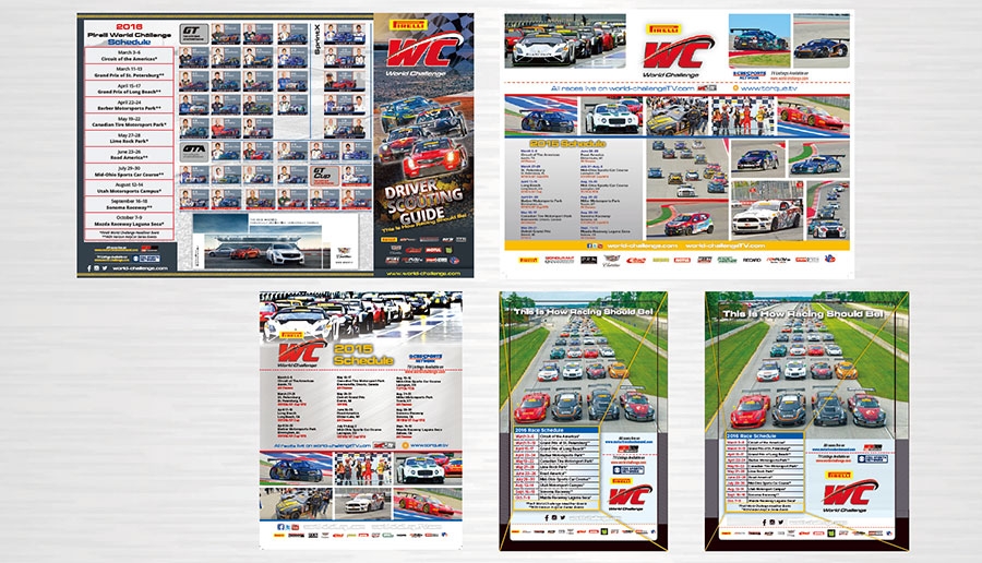
Minimum clear space around PIRELLI WORLD CHALLENGE logo. The PIRELLI WORLD CHALLENGE logo must be surrounded by adequate clear space, otherwise known as “minimum clear space”. Minimum clear space ensures immediate recognition the overall impact of the PIRELLI WORLD CHALLENGE logo.
Read more
Welcome to the AgResearch Visual Identity Guidelines.
These standards describe how the visual identity and the brand architecture will be applied. They should be read in conjunction with the Brand Strategy.
Read more
")


")


")


")


