")


")

A carefully managed and well-implemented brand identity program is essential to presenting a unique, strong and unified image to the world.
The guidelines outlined on the following pages are intended to ensure that the elements of Connecticut’s branding program are used correctly and consistently.
Along with examples of correct usage of the logo, typography, color palette and other elements, specific directions are included to guide the design and production of Connecticut’s tourism communications materials.
Accurate implementation of these brand identity elements will build equity in our brand and strengthen and unify our messages in marketing Connecticut tourism.
We encourage the tourism industry to implement these brand standards throughout all of their promotional materials.
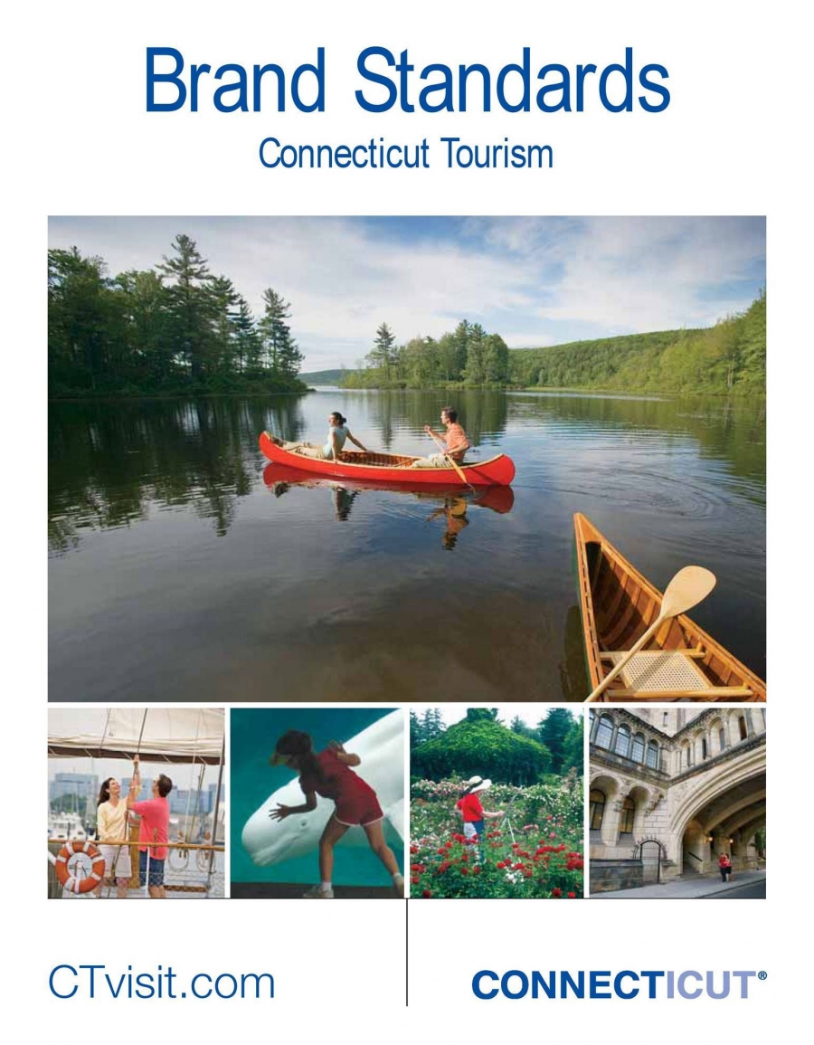
Connect Icut Brand Standards
The Theme
Connecticut has taken ownership of the word CONNECT, a compelling word that emphasizes the state’s close proximity to its target audiences as well as the opportunities our consumers have to connect with a variety of different experiences within the state.
By owning the idea that Connecticut is a place where you can connect with yourself, your feelings, your friends and your loved ones, your inner adventurer, etc., we have created a place that is more than a mere destination — it is a place where our consumers can escape from the daily grind and make an emotional connection. This is a very powerful ayoff.
The CONNECT theme is an essential component of the Connecticut brand identity program, not only because it gives us a unique position within the tourism industry, but also because it allows us to do what no other state has — incorporate our state’s name into our theme.
")


")


