BrandEbook.com est un manuel du musée numérique de la marque. Notre collection comprend : un manuel de la marque, des directives d'identité d'entreprise, des normes graphiques, des directives d'identité visuelle, un ebook de marque, un manuel de marque, une brochure d'image de marque et un guide de style de logo.
BrandEbook.com est un site de collection et de publication de ressources ouvertes. Nous collectons et organisons le contenu, mais nous ne possédons pas les droits d'auteur.
Tous les fichiers, images, fichiers audio/vidéo, marques, traductions de textes et autres éléments de ce site appartiennent à leurs auteurs et propriétaires légitimes. BrandEbook.com ne revendique en aucun cas le droit d'auteur de ces documents.
Bienvenue à rejoindre notre plan d'abonnement pour nous soutenir, vous pouvez télécharger le manuel de la marque PDF.
Si vous souhaitez afficher un manuel de marque sur notre site Web, ou si vous souhaitez annuler la publication de votre brochure de marque, veuillez cliquer sur Nous contacter pour soumettre des informations.
Marque Manuel télécharger Catégories.
Nous avons soigneusement sélectionné à partir d'un lot de manuel de la marque ( directives sur l'identité de marque de l'entreprise ), fournir une description simple et le lien de téléchargement . Cliquez ici pour accéder à la page recommander .
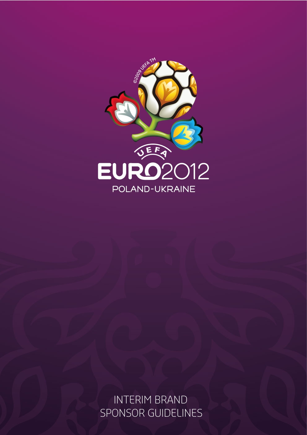
Use of the logo and graphic marks
The UEFA EURO 2012. brand manual can only be used by authorised parties who have been granted the necessary rights by UEFA. This brand manual outlines the graphic principles, the colours, the graphic arrangements, template solutions and the rules of association between the o!cial marks and logos.
Lire la suite
YOU ARE IN A CASINO and you’ve just placed a huge bet on the roulette. All money on number 18. Suddenly you’re back in that state-of-mind, the state you’re in just before you know if you’re winning or not. A moment when the pulse rises and the adrenalin boosts; when everything freezes and you feel every heart beat pounding.
Lire la suite
The Zebra brand exemplifies our promise to empower our customers to know more about their business and make intelligent, informed decisions.
These Zebra Brand Guidelines have been created to provide visual consistency throughout brand communications across various media and applications. For any questions, please refer to the contact information on the last page.
Lire la suite
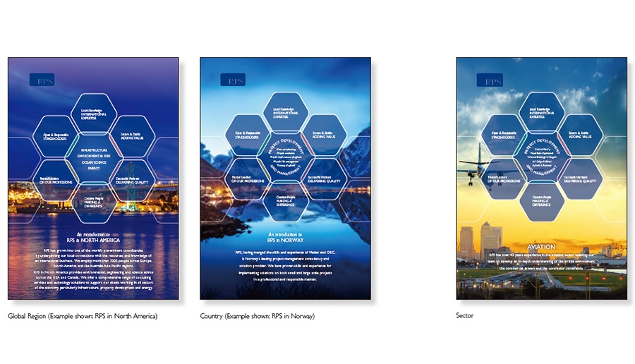
We believe that developing and delivering an effective RPS brand strategy can help us build our reputation, make us stand out from our competition and project our values. This will help us to attract the best clients, staff and investors in our business.
Lire la suite
")


")


")


")


